1. Ideas for logos or logo themes
A computer of some kind with people living in/on it and performing various activities in/on it. Perhaps a mounted "HCoop" sign on top of it. --AdamChlipala
A stylized drawing of a rackmount server inside a circle, with hands/arms coming symmetrically from different directions to touch it. Probably monochrome or close ot it. --AdamChlipala
2. Logos
2.0.1. Sense
http://hcoop.net/~aku/hcoop_logo/hcoop_sense.png
2.0.2. Clear
http://hcoop.net/~aku/hcoop_logo/hcoop_clear.png
2.0.3. Fade
http://hcoop.net/~aku/hcoop_logo/hcoop_fade.png
From the Attic: http://hcoop.net/~aku/hcoop_logo_attic.html
2.0.4. geek
http://hcoop.net/~aku/hcoop_logo/hcoop_geek.png
2.0.5. script
attachment:hcoop-script.png
2.0.6. Planet
http://detriment.org/planet-round.png
http://detriment.org/planet-round.svg
- Best logo yet! I very much like the circled-planet center. Not so sure I like the cropped "h" on top, perhaps it could be modified. But this one is showing promise. How about changing it to a fat, capital H instead? Something like a less ugly/more stylized version of this:
(Obviously that H is too wimpy-looking, but that seems to be a more balanced-looking/symmetrical logo.) --NathanKennedy
I like this a lot. Even though Adam says that text may work against us, I think using the planet in the center and then a simple "HCOOP" in the black ring would look great. Perhaps the HCOOP being at the same arc as the ring. --JohnSettino
Quick symetrical job before work:
http://detriment.org/planet-sym.png
http://detriment.org/planet-sym.svg
2.0.7. More planet
This is actually Chris "det" Clearwater's design which I only slightly modified and I offer it here because I liked something about it. --DavorOcelic
http://hcoop.net/~docelic/planet-alt-docelic.png.png
I like the text/logo juxtaposition here. Perhaps this simple route is better than trying to do clever things with the letters. However this planet looks a bit too egg-shaped, maybe a little more round would be better. I'm not sure if I prefer the original planet color-scheme or not, I suppose that's just a matter of taste. --NathanKennedy
I'm also not too gung-ho about incorporating text into the logo. A simpler yet more distinctive logo that uses a graphic that symbolizes us in some way could be much more effective. --AdamChlipala
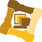
2.0.8. Four Hands
Try at mixing the Ubuntu style of portraying cooperation with more 'square' theme.
|
Tilted 45 degrees. |
Left hand versions and svg files are here: http://anil.net.in/images/drwg/hcoop/ -- AnilNarayanan
These are interesting looking logos. However I didn't know they were hands until I read your email. They look more like whales, or mittens, which is kind of strange. --NathanKennedy
How about this one ?
http://anil.net.in/images/drwg/hcoop/hcoop_rh3.png
Better! --NathanKennedy
Nice. It would be better if there was some aspect of the logo that indicated some semi-unique characteristic of HCoop, though. There are lots of co-ops out there to which these logos would apply equally well. --AdamChlipala
3. HardCore
http://www.detriment.org/knuckles.jpg
Cute. But no. (This one comes from ChrisClearwater by the way). --NathanKennedy
Yeah, it was a joke. I had fun doing it. --ChrisClearwater
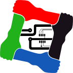
3.0.1. Four Hands Inlay
Web pages being served |
Networking and Internet theme |
I really like the general idea behind these two! I'm not too thrilled about the 4 arms though. For some reason I get this odd vibe from it. Instead of 4 arms perhaps it would look better if it were just two hands grasping each other. Or, a bunch of hands underneath the world/webpages. Actually if its not too hard could you just bring out the world/webpages that are in center so its in the foreground and is ontop of the arms. I'd like to see what that looks like. --RobGubler Here you go:
http://anil.net.in/images/drwg/hcoop/hcoop_rh_globe_z.png
I'd rather not do the same to the web pages one as the inlaid picture does not have (black) borders (like the globe) and it blends with the color of the hands, making a mess. I thought some regular shape binding a theme is good for logos to be used in a different places (ranging from the main pages to the tiny icon beside the URL). When shrunk, the inlay graphics are losing significance. Its just the shades of the hands and the overall shape that is felt. We should try another web-pages graphic to be placed over the hands. -- AnilNarayanan
That was quick. I like this; it's clean, simple, and elegant. --RobGubler
3.0.2. Some more combinations
Primary colors used |
Dropped the hands |
3.0.2.1. Other inset pics
'h' for hcoop |
PCB indicating computers. |
I'm really really liking your last few batches of logos. They look very professional. Probably the PCB one is not the most appropriate however, since "hardware" is sort of incidental to our purpose. I love the globe graphic you did as well with the swoopy orbit, that was very clever. However I had to stare at it for a long time to figure out that the thingy on the end is an RJ-45 plug (the networking hint clued me in)--the first thing that came to mind was that it looked like a tank. Perhaps if the tab and the pins were a little more visible? --NathanKennedy
For what it's worth, the correct identity was immediately apparent to me. --AdamChlipala
Tried improving the RJ45 connector
Bigger copy of this with transparent background is [http://anil.net.in/images/drwg/hcoop/hc_rh_glb_rj45_big.png here] |
Its a bit cartoonish; I wanted to avoid too many fine lines. There is a small problem I ran into while making the new logo and did some dirty fixing. Let me know if you could figure out the issue from the pic. --AnilNarayanan
3.0.3. business style
http://www.geocities.com/kuribas/hcoop.png
This logo has a businesslike style. Actually it is not really a logo, but more a top-banner for the website. The connected o's stand for cooperation, while the mouse stands for, well, the internet ![]() --KristofBastiaensen
--KristofBastiaensen
3.0.4. Badges
A sample attribution pic. The 'proud member' phrase is from MichaelOlson's [http://www.mwolson.org site]. (Gif format is [http://anil.net.in/images/drwg/hcoop/hcbadge.gif here]) --AnilNarayanan |
I don't think we've ever used "H-Coop" to name ourselves before. I've taken to using "HCoop" without any official discussion. There's room to settle on a capitalization/etc. convention that everyone likes, but we should definitely be consistent. --AdamChlipala [Someone overwrote this post in an edit, perhaps not paying attention to the warning that someone else is editing.]
For those that use HCoop DNS only on some sites. --RyanMikulovsky |
Thanks Anil and David! It looks great. --MichaelOlson
Removed hyphen from name -- AnilNarayanan |
|
Link to hi-res (1024px x 1020px) image [http://anil.net.in/images/drwg/hcoop/hcooprh.png here]. -- AnilNarayanan